Contents
- Research into artists that are linked to advertising
- Trip to Battersea Power Station
Resarch 1: Mouton Rothschild

Every year, the wine company Mouton Rothschild has a different artist design the label for their wine. That means a collection of these wine bottles is like a history of art. It was interesting to see a label by Olafur Eliason as I saw his exhibition at the Tate Modern.
Olafur Eliason – 2019
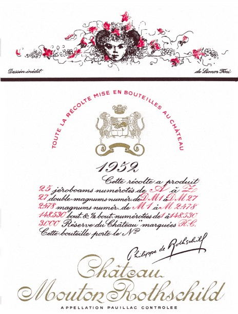
Leonor Fini – 1952
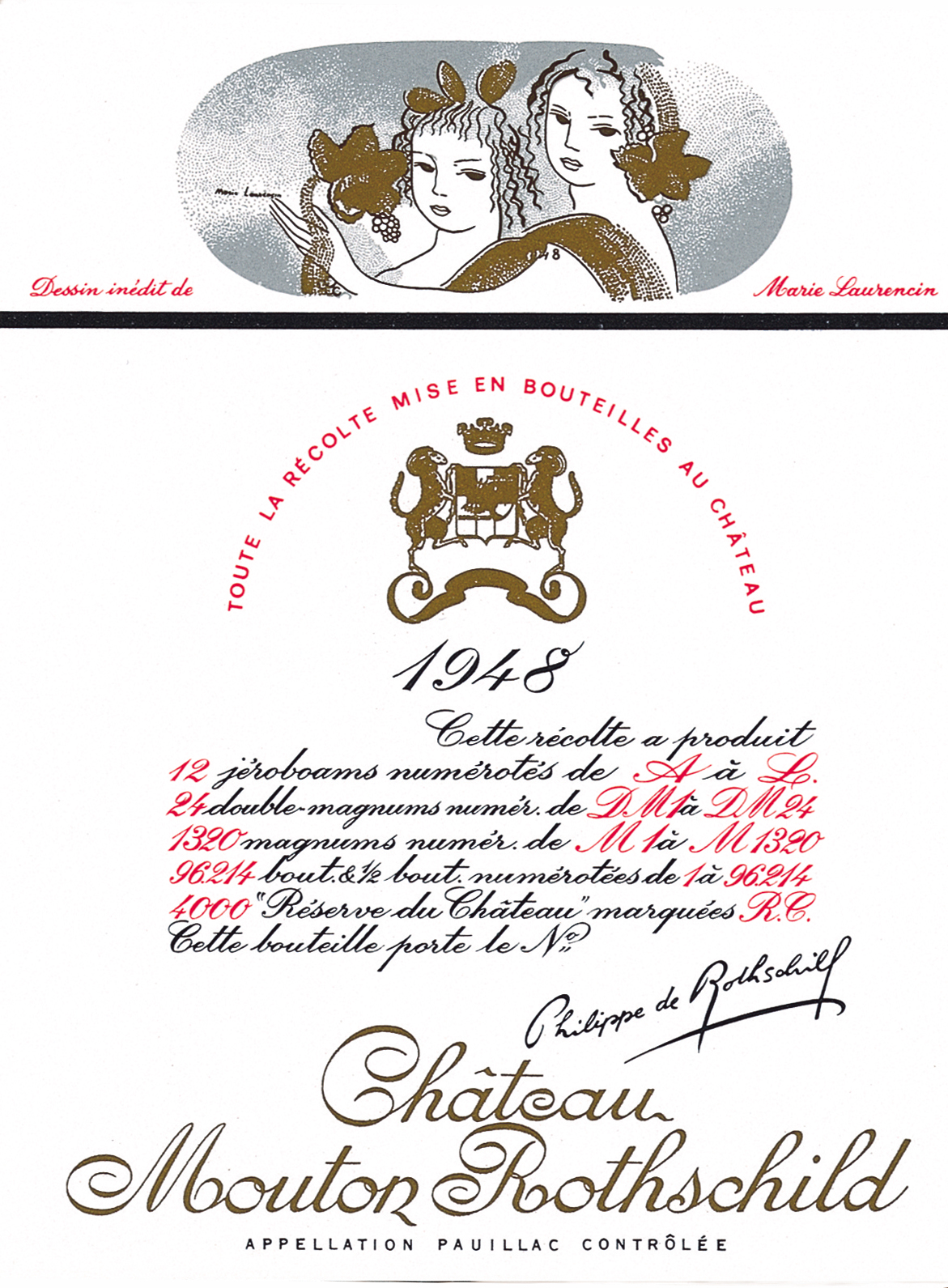
Marie Laurencin – 1948
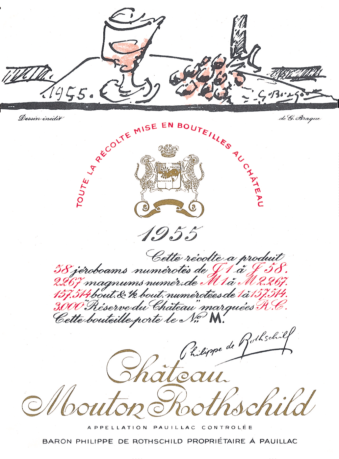
George Braque – 1955
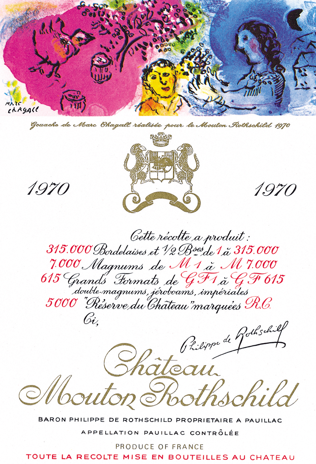
Mark Chagall – 1970
Robert Motherwell – 1974

Peter Doig – 2020

Reflection
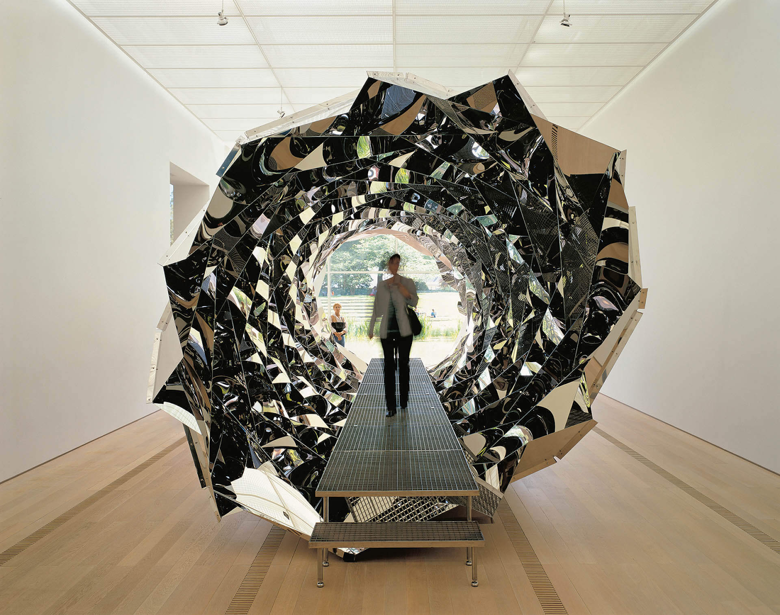
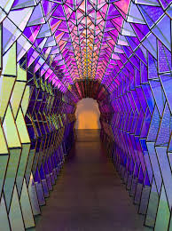
My favourite label was the one designed by Olafur Eliason because I like the dark yet bright colours in the painting. I also like the 3D drawing with the black spot in the middle. I tried to find patterns like this in my environment when taking the photos. Olafur Elison makes art and sculptures with colour and patters. Here are some of his other works.

Even though I liked the art on these bottles of wine, I don’t think it is a good idea for established artists to let their art be used to sell products. I think the majority of the time they are selling out when they do this. Also if it is already a big company, I don’t think it will be necessary for big artists/famous people to advertise their company and they could be exploiting less well-known artists. Art isn’t there to make you want to buy things.
Research 2: Andy Warhol and Pop Art
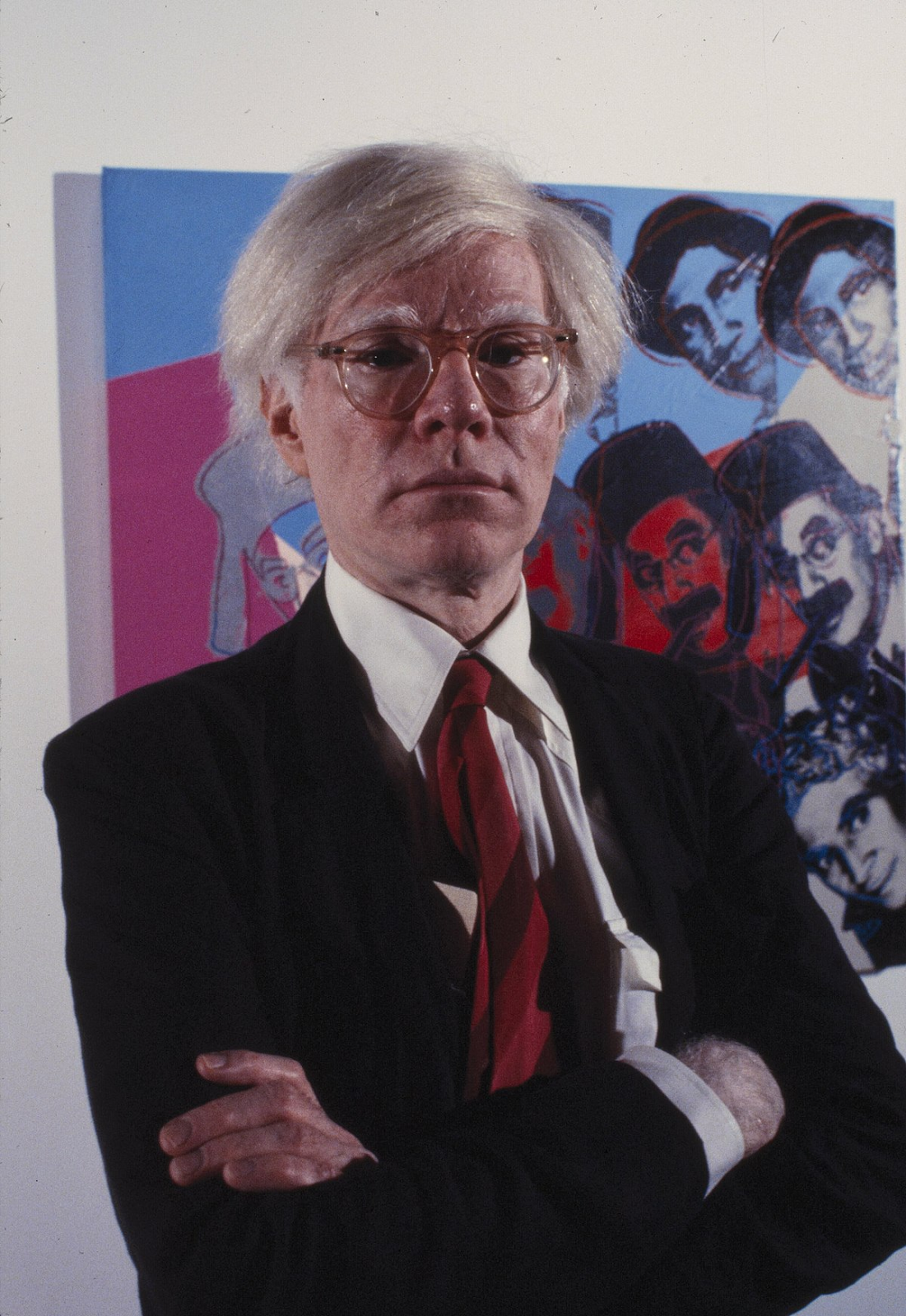
Andy Warhol was born in Pittsburgh, Pennsylvania on August 6, 1928.
He studied commercial art at university which meant that when he was learning he was interested in advertising and making art for adverts. Commercial means to do with buying and selling. Someone who did this at university would usually go and make designs for big companies instead of fine art. Normally people would get a job making adverts after this but instead, Warhol made art that used adverts instead..
“By elevating these advertisements to the status of art, Warhol challenged traditional notions of beauty, originality, and artistic merit. Another notable work from the Ads portfolio is “Mobil,” which showcases the iconic Mobil Oil logo against a bold red background.”
https://guyhepner.com/artworks/categories/1/11170-andy-warhol-ads-f.s.-ii-350-359-1985/
I like Warhol’s art because it’s unique and mostly has a combination of bright dark colours. Contrasts like this are used a lot in advertising.


Art using symbols and iconography from adverts.
Event Review: Battersea Power Station December 2022


We went on a trip to Battersea Power Station. While we were there we did Ice Skating and shopping but we also looked at the architecture of the building and I made connections to my Arts Award Unit 1 A project where I photographed buildings and architecture in my local area. I enjoyed ice skating and exploring different stores to see what I could buy. I also enjoyed talking about the shapes and patterns in the building. This building took 6 years to build and was also a working power station for around 50 years. It has recently been renovated.
In terms of art, this building was used on the front cover of an album by the band Pink Floyd.
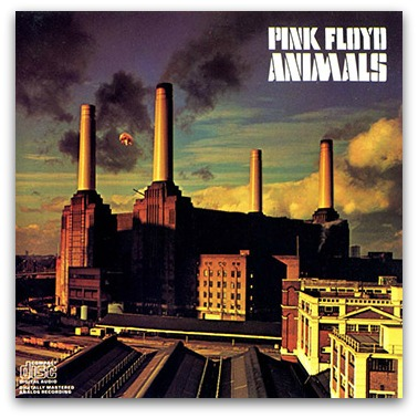
I like this cover because it gives an old aesthetic vibe with the bright yet dim colours. It’s something I tried in my photos, to create something with bright colours but a dim and gloomy atmosphere.
The location for my photos and the Power Station both take place in south London. However, Battersea power station is in South west london while Old Kent Road is in south east london. Battersea power station is also considered posh yet old kent road is not. I think there is a contrast between this old and impressive building and the run down buildings on the Old Kent Road that aren’t really taken care of. Those buildings don’t get renovated they just get knocked down and replaced.