Working on the project
Although we all worked on all parts of the project I was in charge of the design. I designed the cover and I will talk more about it later on this page.
We met ten times as a group to discuss the Magazine.
All of the meeting minutes are available here: https://drive.google.com/drive/folders/118irwsMMsJCfr-m2cAzow0vgndIvxinU?usp=sharing
My Involvement
I was the lead designer for the project so I was very much involved in how the final magazine. A lot of the ideas for design were mine although I did discuss them with the group.
Designing the cover
After the first two meetings, I was given the job of cover design. I am good at Photoshop and Illustrator as well as other software. My first step was to make some different designs for the group to vote on. This process is talked about in the meeting minutes as well.
I set up this Google Drive Folder to store everything and make it easy to share things:
https://drive.google.com/drive/folders/11SNhI6WIQ6LU2W4k2Fctg1EPtbaYJEAn?usp=sharing
My initial designs
I made these with images I found online as they were just rough suggestions for the group:
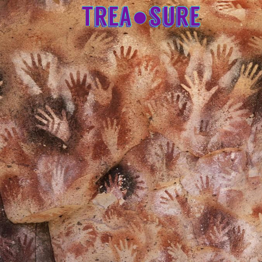
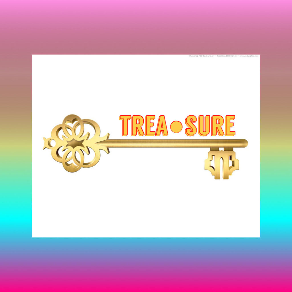
I showed these to the group and they voted for the first image. They had some comments and feedback that were:
- This should be a wrap-around cover like we saw on some of the example magazines, we like how that looked
- It would be good to have all the names of the contributors on the back page
- Perhaps people could pick their own colours for hands to make it more personal
I took all of this into account when making the next draft.
Towards the end of the process, we started having practical sessions in our meetings. In one of these sessions, I set up acrylic paints and glitter so that everyone involved could make a hand print.
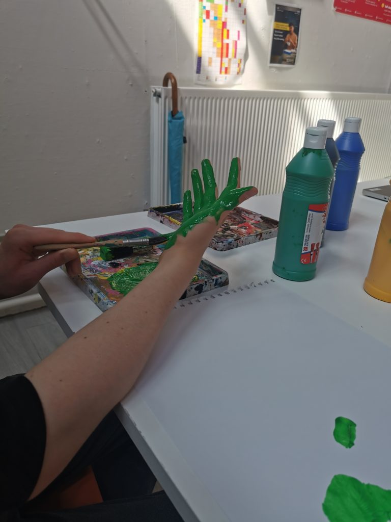
Some of the prints:
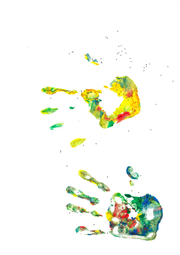
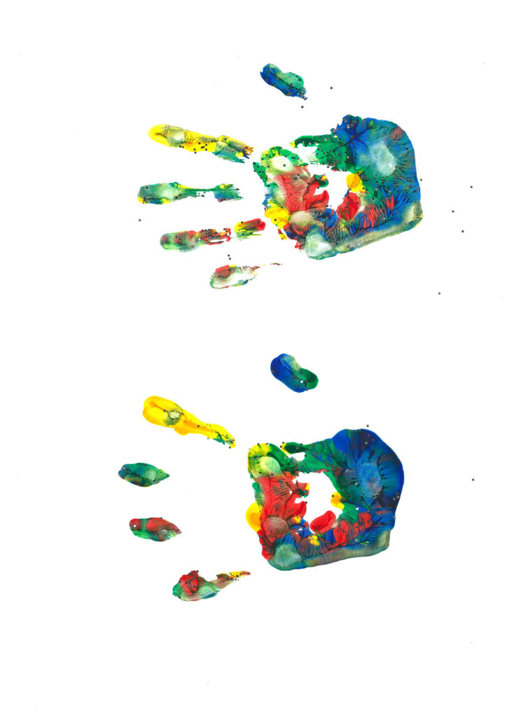
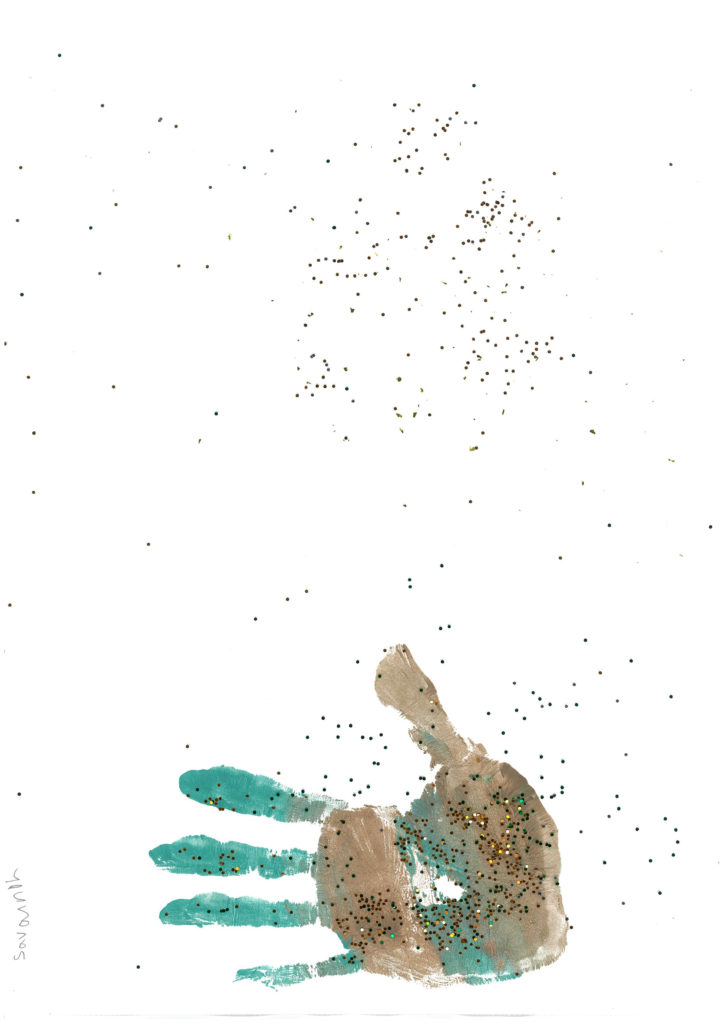
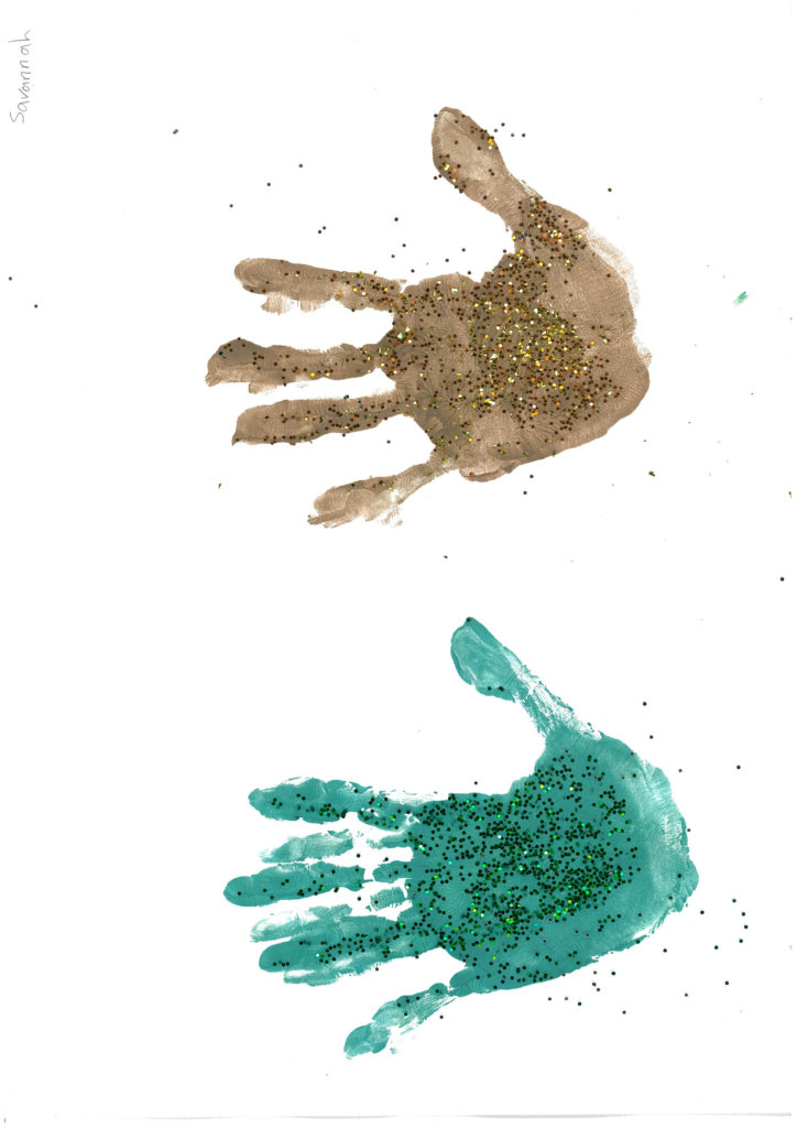
The Final Design
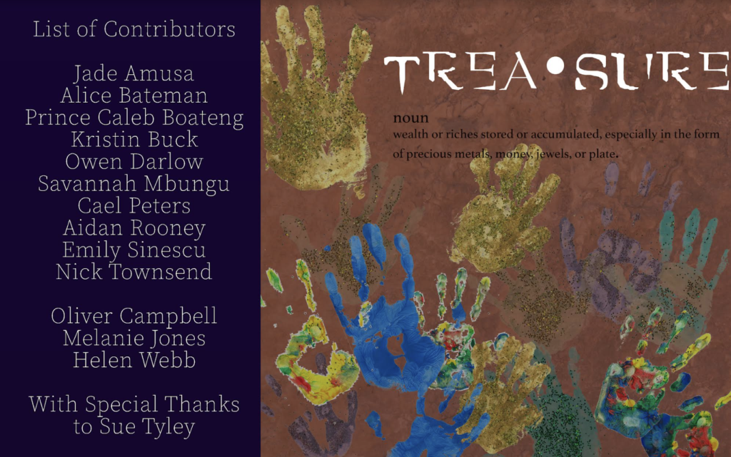
I made this design using photoshop and the hand prints and the group was very happy with it. We had it printed off and laminated for the exhibition to go with the display of prototype magazines.
Me and Melanie had to communicate a lot by email:
message from Melanie:
On Tue, 6 Jul 2021 at 15:35, Selena (Pauline) Wiltshire <pauline@treasurehouselondon.org> wrote:
Hi Aidan,
I hope you are managing to get some rest. Please see the below email from Melanie.
Hi Aidan,
Sorry I wasn’t in last week to help you with the Arts Award, it seems like you did a great job and got a lot done. I read your martial arts article and it’s very good. I haven’t watched the documentary yet as it’s been a busy day catching up but I will have a look at it tomorrow.
I just want to make sure we have everything we need to get you your arts award so if you could let me know how they are going, let me know.
The documentary – Would you say it is complete?
Evaluations – We need evaluations / feedback for the leadership project and the documentary. These things could potentially be done at home and I can send worksheets. We need at least one evaluation to demonstrate that you are of A Level standard.
The magazine – Would you be interested in working on any more of the design aspect of this? I know it might feel like you are carrying a lot of the work with other students away and you have done a lot already so don’t worry if you feel like you are done with it. We will be having a launch party at the same time as the end of term party and Savannah will be organising that.
I would also like to send you a link to the website when all the evidence is uploaded so that you can check it over.
All the best,
Melanie
Selena WiltshireStudent Support Coordinator
From me….
Sure, I’d be happy to do the evaluations at home, and yeah I feel like the documentary is done. I’ve designed the pages for the magazine, which should be in the arts award magazine folder on the media computer, it seemed like most people liked the sea design the most when I asked Fiona and some other students in the project so I think we should go with that one, it should be called pagessea.psd or something along those lines, but there’s also a night sky design if that works out better. I’d prefer if someone else would be able to finish it off by adding the art and info boxes onto the pages though. I should probably be back for the leaving/magazine party, but if there’s anything you need me to come in for please let me know.
Thanks
Aidan
The Pages
In one of our early meetings, we decide that we would tie into the theme of sunken treasure and pirates to go with the title but also because artistic ability can be like a sunken treasure. I thought it would be a good idea to ask some of the group who are good at illustration to draw some pictures to illustrate each of the pages. We could use a photoshop layer blend to merge the artwork with a blue background that would be like the sea. The group liked my idea so I asked Jade and Kristin to do some illustrations. When they had done a few, I cut them out and scanned them.
Scans:
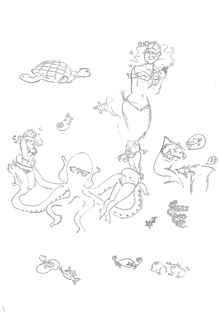
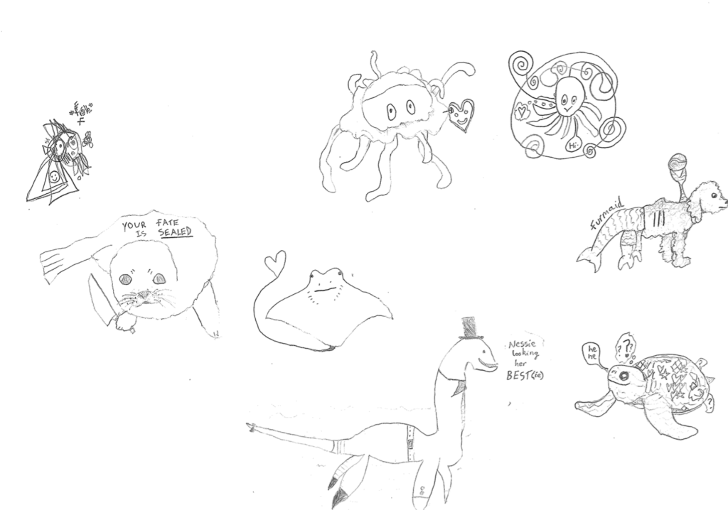
Then I edited them into the pages for the magazine:
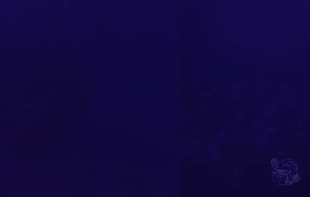
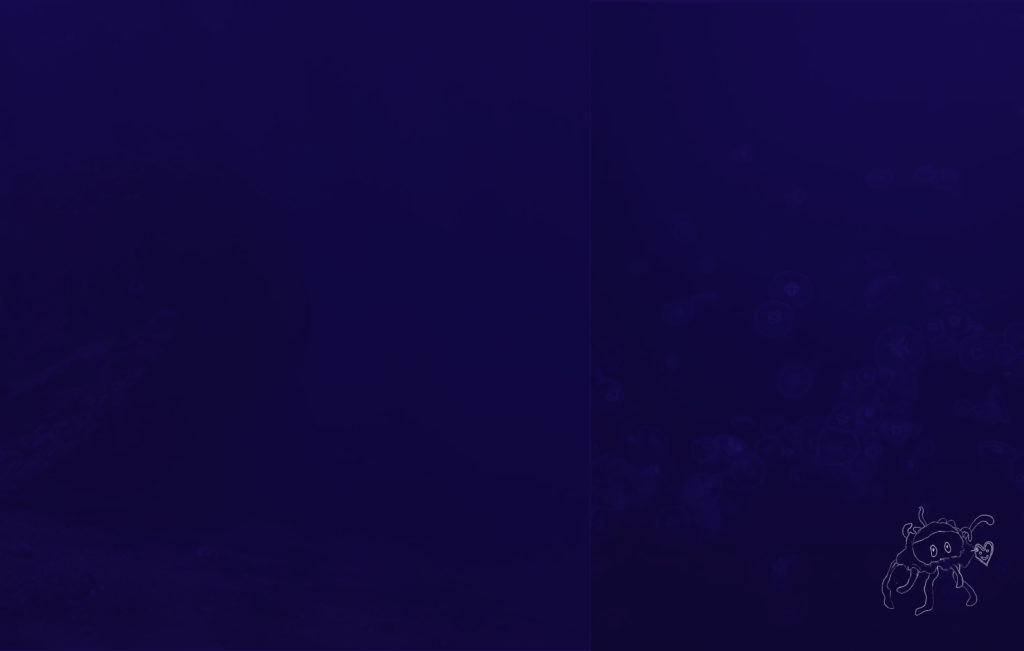
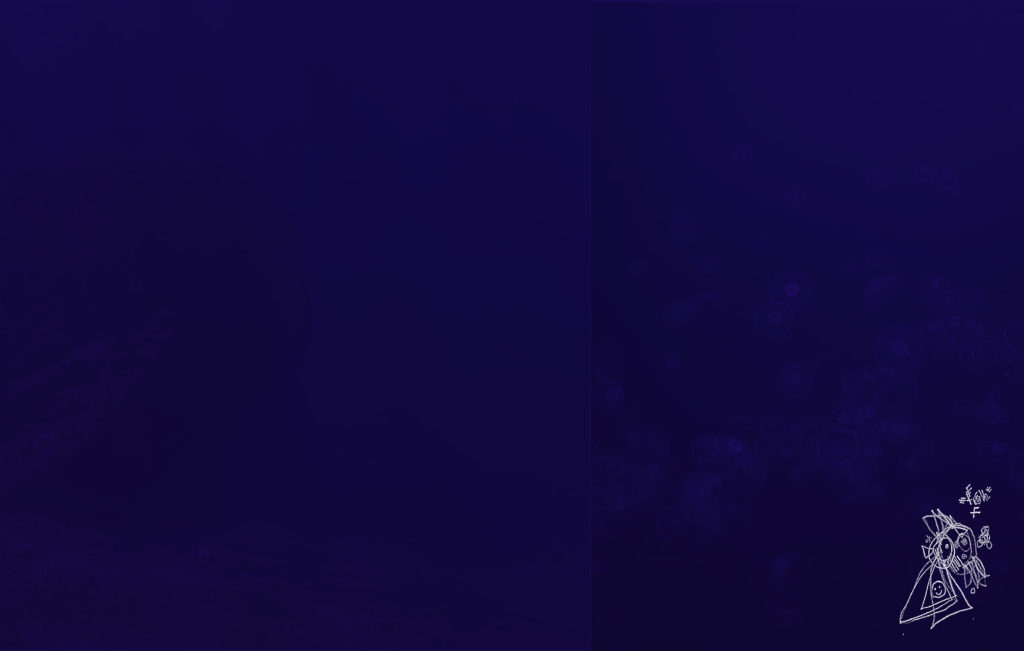
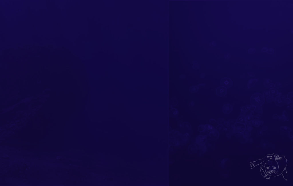
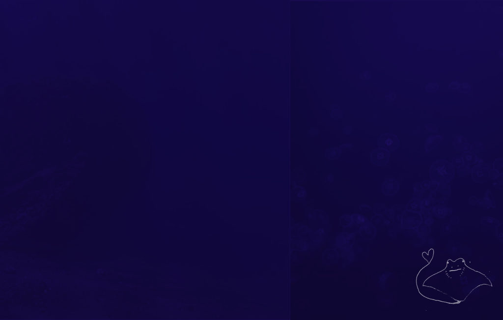
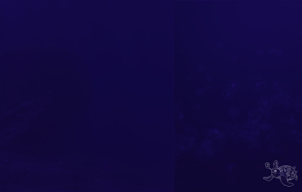
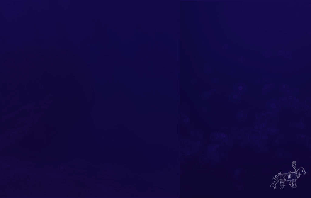
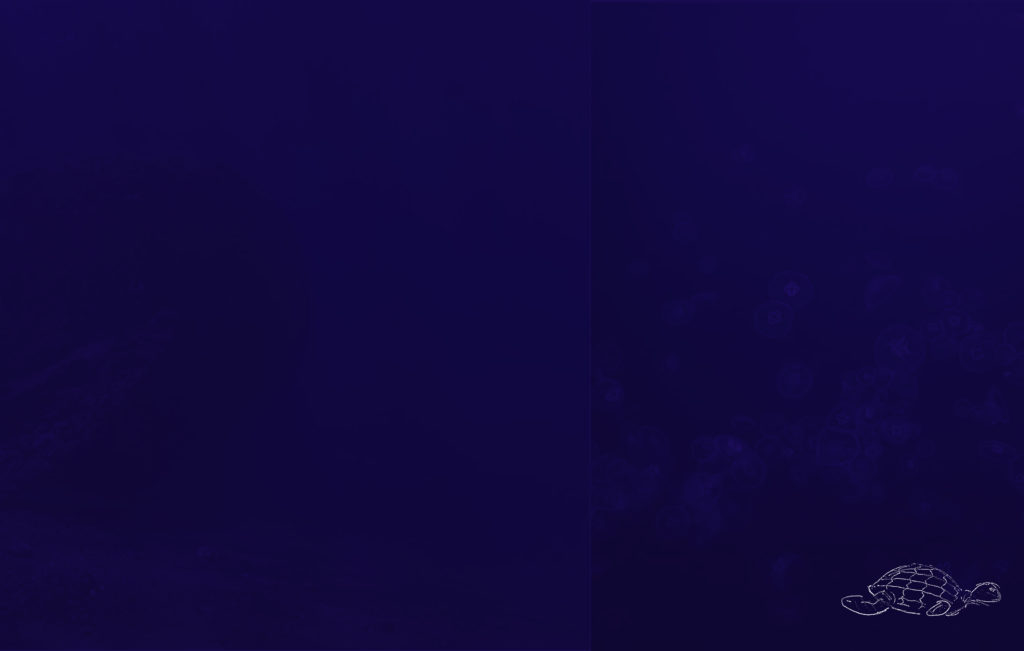
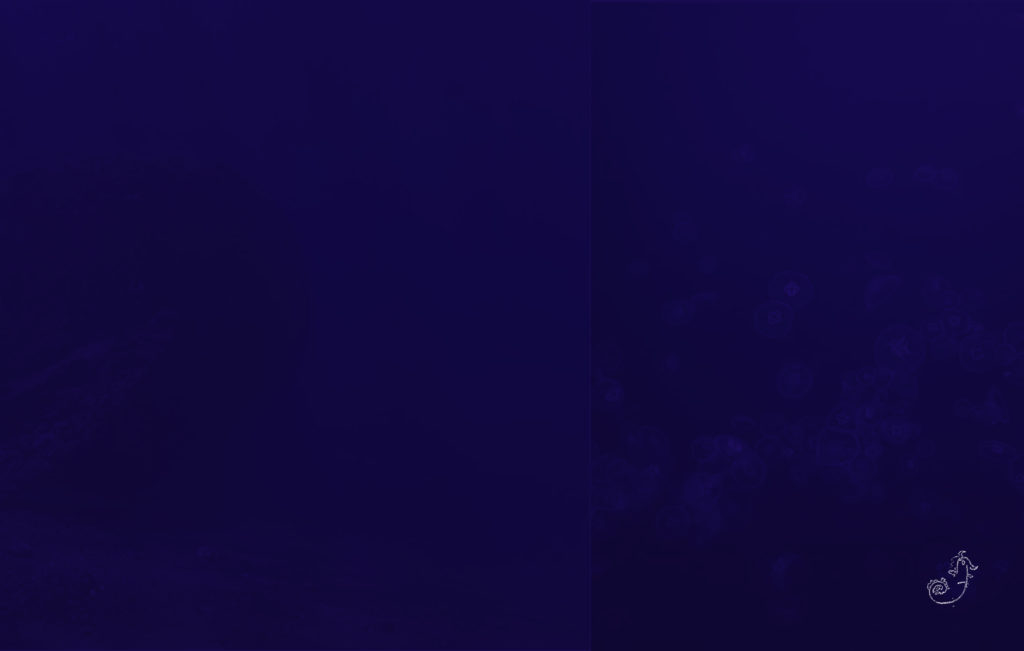
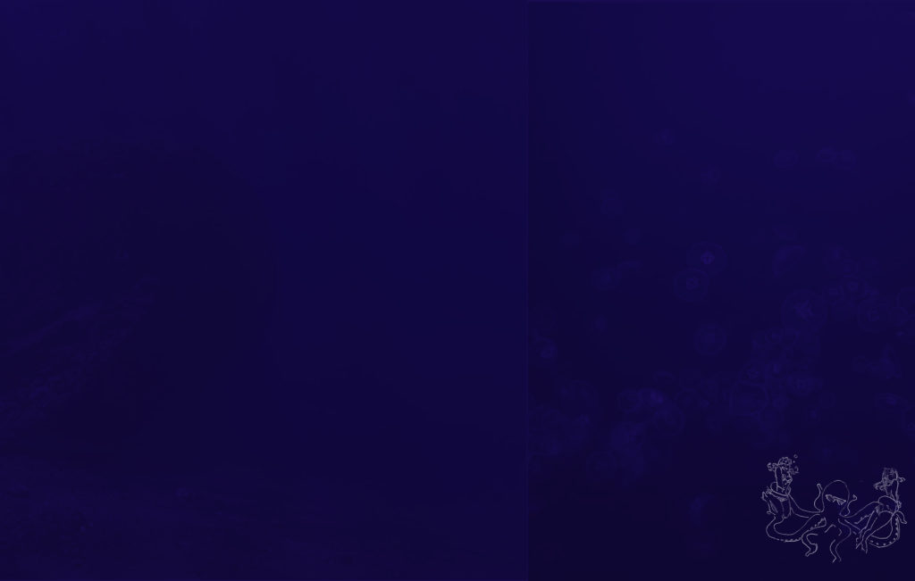
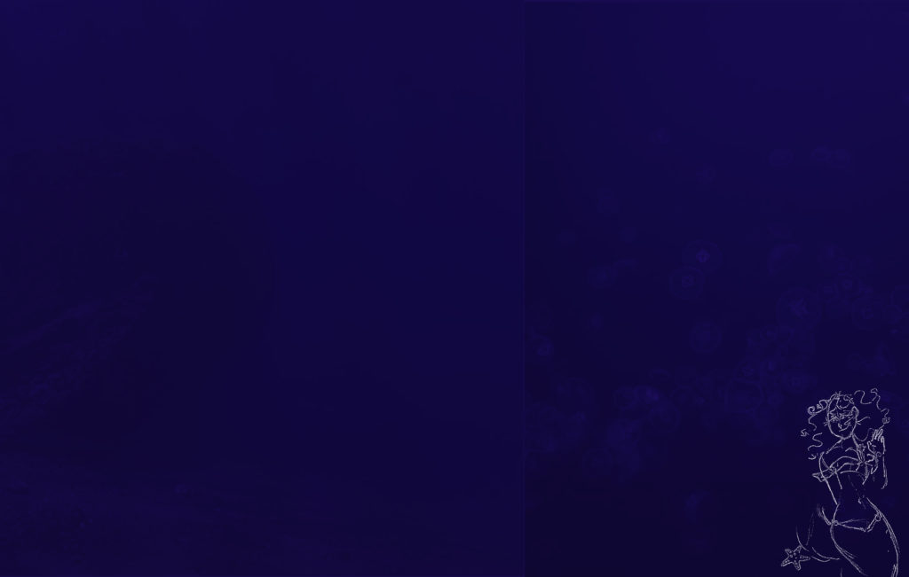
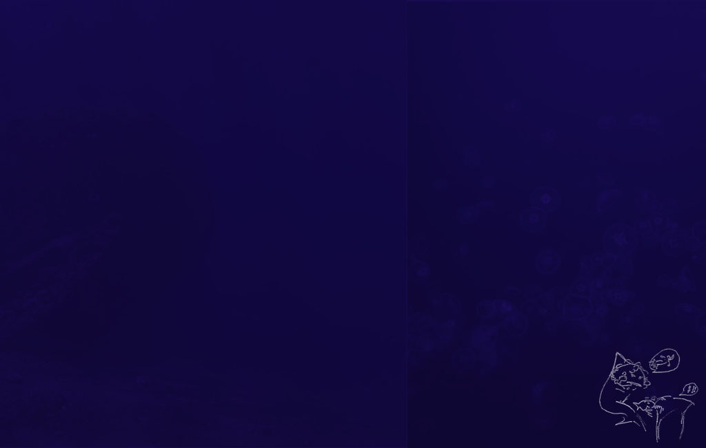
These were the blank pages that I made. Once these were done the rest of the editorial team could add the content to the pages.
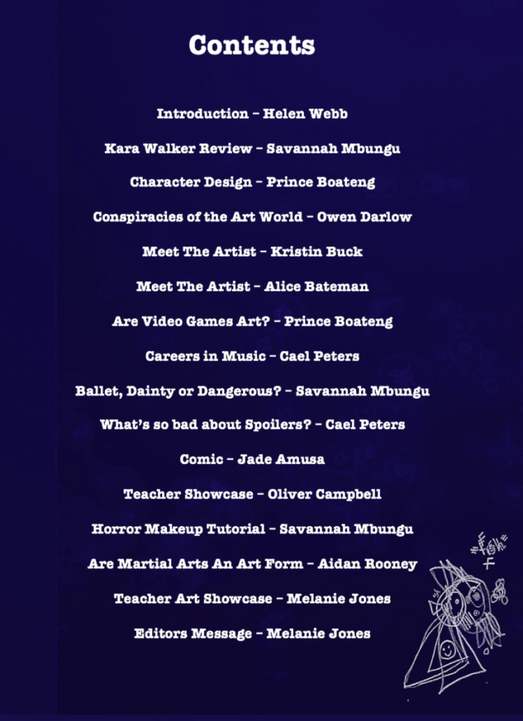
I made the contents page once everything was uploaded.
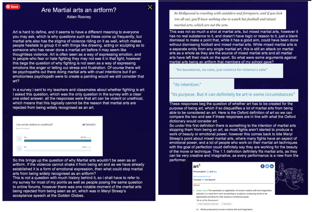
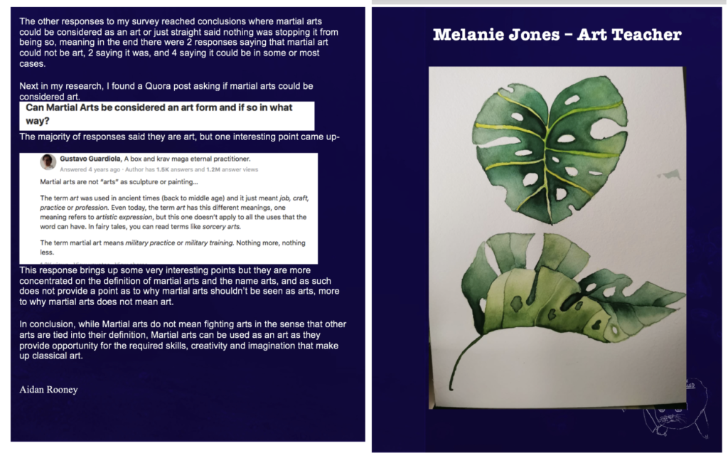
I helped to add some of the content including some articles that I had written:
Meeting my leadership skills
| Creating a design that showcases the work of everyone | I think that my design showcased the work well, the dark blue background helped the pale articles to stand out. I put illustrations by Jade and Kristin on every page. I included everyone’s handprint on the cover. |
| Working with others to produce a final product | We all had to work as a team to make this magazine. One person on their own could not have done it. |
| Managing others and delegating | I think I have improved on this a lot. I worked with the team and listened to their comments. Sometimes in the past I have wanted to do it all myself, but this time I was able to let others help and take part. |
| Helping artists to be confident in their work. | I think asking Jade and Kristin do the illustrations for each page boosted their confidence |
| Talking to other team members and making joint decisions | We took votes on everything and listened to each other and we include people who could not attend by having a Zoom set up. |
Working with Sue
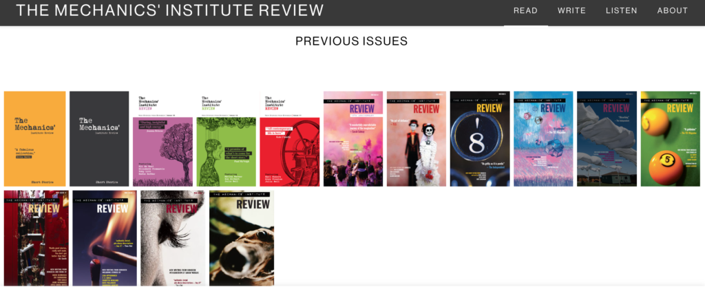
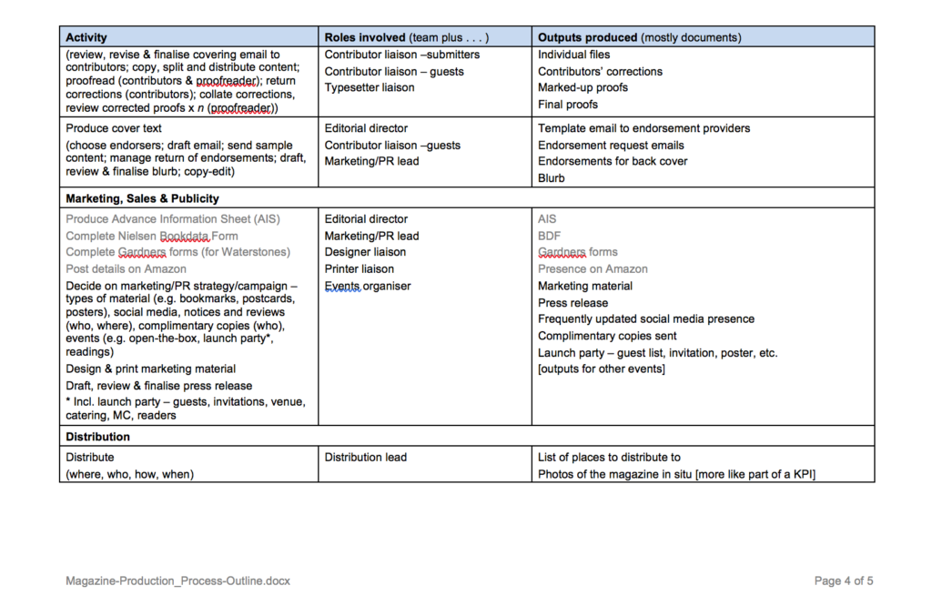
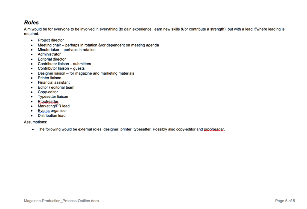
Sue Tyley, a professional publisher and copy editor had a Zoom meeting with us when we were getting started. This was a great experience. Sue worked on The Mechanics Institute Review Print edition as well as many other projects.
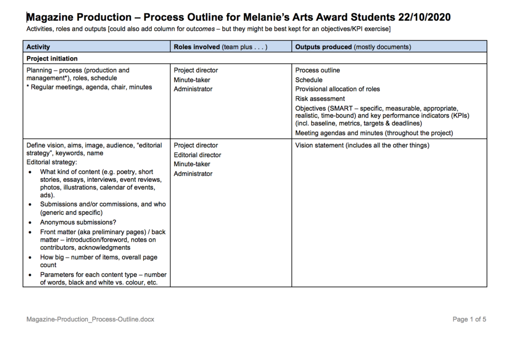
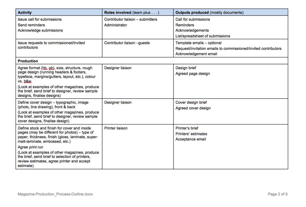
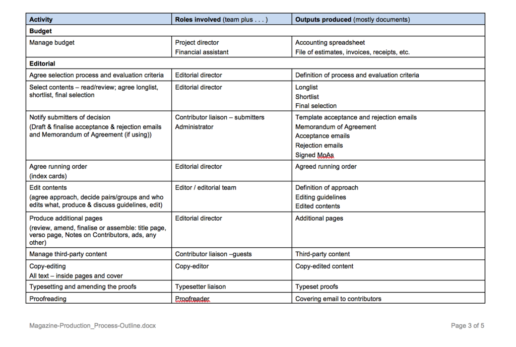
The Planning document Sue gave us:
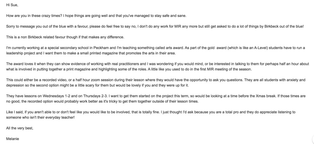
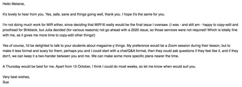
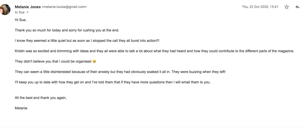
EMAILS BETWEEN SUE AND MELANIE
